Essential Tips for Choosing a Pantograph for Your Quilt
- Jody Jacobson
- Aug 13, 2024
- 3 min read
When it comes to edge-to-edge quilting, selecting the perfect pantograph for your quilt can be a very daunting task! With so many options available, it can be difficult to make a decision. So, how do you decide?
There are two key factors to consider when selecting a quilting design for your quilt top: 1. choosing the pantograph design, and 2. deciding on the scale and density of that design.
1. CHOOSING THE PANTOGRAPH DESIGN
STYLE
One of the first things to consider, is the 'style' of the quilt. For example, is it modern or traditional? Some pantograph designs complement classic quilt styles, while modern pantographs can add a contemporary flair. There are also novelty and seasonal pantographs. Below is an example of a modern design on a modern quilt. The pantograph design is called Driftwood. The wavy lines add some movement in contrast to the straight lines and angles in the piecing.

Below is an example of a pantograph that is well suited to a more traditional style quilt. This one is called Paisley Allover.

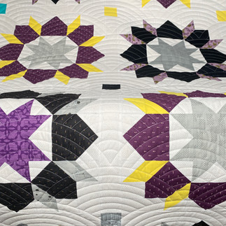
And then there are many pantographs that look incredible on ANY quilt! Here is Baptist Fan on different styles of quilt tops.
Fabric or Pattern
Let the fabric give you clues. If your fabric features floral motifs, a pantograph with daisies could beautifully complement it. For quilts with holiday or animal motifs, selecting a corresponding pantograph can enhance the thematic coherence.
Below is an example where the fabric dictated the pantograph decision. This quilt was made by a member of the York Heritage Quilters Guild and donated to a charitable organization. The pantograph in the second image is called Orange Dream and echoes the fabric motif in the first image.
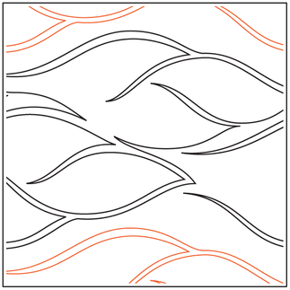
In the quilt below, pieced by my friend, Barb, the red maple leaf made me think of the Canadian flag. The design Time Warp was chosen to give the impression of the maple leaf (or flag) blowing in the wind. This pantograph, as you can see in the first image, is usually a vertical design. I loaded the quilt sideways so the design would quilt out horizontally.
2. DECIDING ON THE SCALE AND DENSITY
Pantograph density refers to how closely the quilting lines are spaced. The three images below show a dense pantograph (Perm), a medium density pantograph (Sprawl) and a low density pantograph (Messy Braid). In terms of scale, almost all digital pantographs can be scaled in size. So, Perm can be scaled larger, but it will still be a dense pattern. Or, I can scale Messy Braid smaller but it is still a low density pattern. Hopefully, that helps explain the difference between density and scale.
Purpose of the Quilt
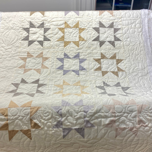
What is the purpose of the quilt? Is it a bed quilt or a baby quilt that will be washed many times. The quilt below was pieced by my client, Avery. It's a beautiful baby quilt. Thread Garden pantograph is a fun and playful design that is dense, making it ideal for a durable baby quilt that will endure frequent washes. Though I scaled it a little larger so the quilt wouldn't feel stiff, as it sometimes does with really dense quilting.
Piecing
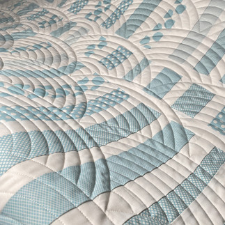
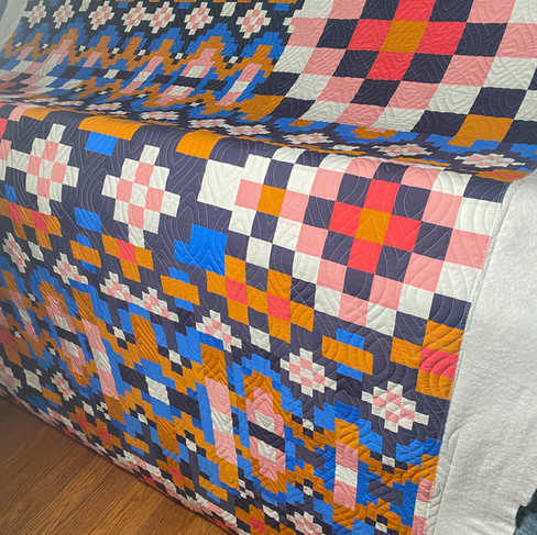
The complexity of your quilt's piecing can also influence your pantograph choice. Quilts with intricate piecing, like the Fado Quilt, designed by Cristina de Miranda and pieced by my client, Cheri, benefit from denser pantograph designs, or scaling down a design to ensure coverage across the seams.
In this case, my client requested the Ikat pantograph and I ensured the scale was appropriate for the quilt.
Finally, while all of these factors can help you to make the daunting task of selecting a pantograph design much easier, I'm a firm believer in trusting your instincts. If you see a design you love, it will almost certainly look amazing on your quilt!
Happy Quilting!
Jody
Stitchwork Studio


